http://census.gov/content/dam/Census/library/publications/2015/econ/g13-aspef.pdf
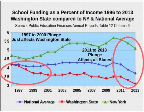
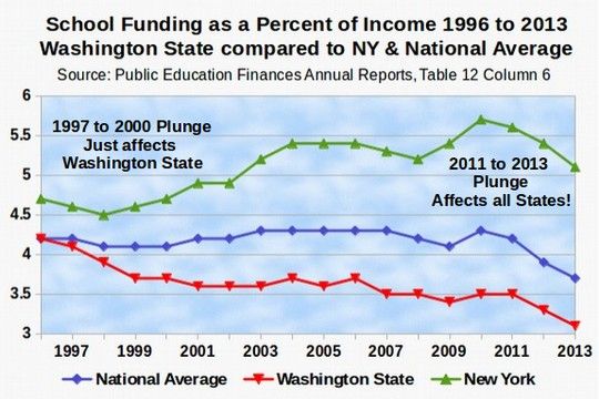
The above chart is based on Table 12, Column 6 of each of the annual reports since 1996. There are some rather startling things about this chart. First, it shows that Washington state school funding as a percent of income plunged rather dramatically between the years 2011 and 2013. This is despite a court order and a commitment by the legislature to increase school funding. As of 2013, Washington spent 3.1 percent of income on pubic schools. In 1996, Washington State spent 4.3 percent of income on public schools which is also about the national average (which is the blue line in the chart above). The difference between 3.1 percent and 4.3 percent is about one to two billion dollars per year. The above chart does not include school construction and repair funding like some of my past charts. Had this been included, the total national average spending would have risen to about 5% of income and the total difference between Washington state and the national average would be about $2 to $3 billion per year.


